Build Beautiful Mobile Apps with the Flower Language UI Kit
Creating a mobile application from scratch often feels like staring at a blank canvas with a deadline looming. You have the idea, the functionality mapped out, and a clear vision for the user experience, but translating that into a polished, professional interface requires significant time and design expertise. This is where a thoughtfully crafted UI kit becomes an indispensable asset for designers, developers, and entrepreneurs alike. The Flower Language App Mobile UI KIT offers a solution that bridges the gap between concept and execution, providing a comprehensive foundation for building visually stunning mobile applications without starting from zero.
A Foundation Built for Flexibility and Creativity
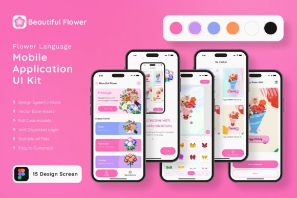
What sets this particular kit apart is its focus on organic, nature-inspired aesthetics combined with practical functionality. The collection includes 15 pixel-perfect screen designs that cover a wide range of common application flows, from onboarding sequences and user profiles to dashboards and content feeds. Each screen has been meticulously crafted to ensure visual harmony, with consistent spacing, typography, and color palettes that work together seamlessly. The design language draws inspiration from botanical elements—soft curves, natural color gradients, and delicate line work—that create a warm, inviting atmosphere perfect for apps centered around wellness, lifestyle, gardening, floral businesses, or any brand seeking a gentle, approachable identity.
Beyond the pre-designed screens, the kit includes over 80 UI elements that serve as building blocks for custom layouts. Buttons, input fields, navigation bars, cards, icons, and form components are all included, each designed with the same cohesive aesthetic. This extensive library means you can mix, match, and rearrange components to create screens that perfectly align with your specific application requirements. Whether you need to add a new settings page, redesign a checkout flow, or create an entirely new feature module, the available elements give you the creative freedom to do so while maintaining visual consistency throughout the entire app.
Practical Applications Across Industries
The versatility of the Flower Language UI Kit extends far beyond a single use case. Consider a small business owner launching a flower delivery service. Instead of investing thousands in custom app design, they can use this kit to rapidly prototype and build a customer-facing application that looks professional and reflects their brand's natural, artisanal quality. The soft color palettes and organic design elements naturally complement products like bouquets, plants, and botanical arrangements, creating an immediate visual connection between the interface and the product being sold.
Content creators and bloggers can leverage these templates to build companion apps for their audiences. A wellness blogger, for instance, could create a meditation or mindfulness app where the calming visual design reinforces the content's purpose. The gentle typography and nature-inspired elements help set the right emotional tone before users even read a single word. Similarly, social media graphics and marketing materials can draw from the same visual language, ensuring brand consistency across every touchpoint—from the app itself to Instagram stories, email newsletters, and promotional banners.
The kit also proves valuable for designers working on packaging design or editorial layouts that need a cohesive digital companion. If you're designing product labels for a botanical skincare line, the UI elements can inspire or directly inform the visual style of a companion mobile app where customers learn about ingredients, track orders, or join a loyalty program. This kind of cross-platform visual consistency strengthens brand recognition and builds trust with your audience.
Streamlining the Design-to-Development Workflow
One of the most significant advantages of working with a well-structured UI kit is the time it saves during the design and development process. Every element in the Flower Language kit uses 100% vector layers and symbol objects, which means components are reusable and scalable without quality loss. In Figma, you can create instances of buttons, icons, and cards that update automatically when you modify the master component. This non-destructive workflow dramatically reduces the time spent making global changes—update a button's corner radius once, and every instance across your entire project reflects that change instantly.
The fully layered file structure keeps everything organized and easy to navigate, even as your project grows in complexity. Layers are logically named and grouped, so you won't waste time hunting through cryptic layer names trying to find the right element. For teams collaborating on a project, this organization is especially critical. A developer can quickly locate specific components, understand the hierarchy, and translate designs into code more efficiently. A fellow designer jumping into the file can orient themselves within minutes rather than hours.
Color customization is another area where this kit shines. The easy-to-change color style system allows you to update the entire palette with just a few adjustments. If your brand uses deep emerald greens instead of the kit's default soft pastels, you can shift the color scheme across all screens and elements simultaneously. This flexibility means the same kit can serve vastly different brands—from a luxury candle company to a children's educational app—simply by adjusting the color palette and typography choices.
Typography, Readability, and Visual Hierarchy
The inclusion of free fonts with the kit removes one more barrier to getting started. The selected typefaces complement the botanical design language beautifully, offering a balance between personality and readability. When choosing fonts for your own project, consider how the typeface communicates your brand's character. A flowing script font might work beautifully for headings on a wedding planning app but could frustrate users if applied to body text or form labels. The kit's typography choices demonstrate this balance—decorative elements for impact, clean sans-serif options for functional text.
Readability should always be a priority, especially on mobile screens where space is limited and users interact through touch. Test your font pairings at various sizes to ensure body text remains legible on smaller devices. The 100% scalable vectors in this kit ensure that text and UI elements maintain their clarity across different screen densities, from standard displays to high-resolution Retina screens. Pay attention to contrast ratios between text and background colors, particularly for users who may have visual impairments. The kit's default color combinations have been designed with readability in mind, but any customizations you make should preserve that accessibility.
From Template to Unique Product
While the Flower Language UI Kit provides an excellent starting point, the real magic happens when you make it your own. Start by identifying which of the 15 screen designs most closely aligns with your application's core flows. Map out your user journey and determine which screens you'll use as-is, which need modification, and where you'll need to create entirely new layouts using the available UI elements. This planning step prevents you from feeling overwhelmed by the options and helps you work more purposefully.
Next, customize the visual identity to match your brand. Swap out the color palette, adjust typography to your chosen typeface pairing, and replace placeholder content with your actual copy and imagery. The note about preview images not being included in the download files is worth remembering—plan to source your own photography or illustrations that align with your brand's visual direction. This is actually an advantage, as it ensures your final product feels authentically yours rather than a template someone else might recognize.
Consider the broader ecosystem of design assets you might need. If you're building a brand around this app, think about how the visual language translates to your website, business cards, merchandise, invitations, or print materials. The organic, nature-inspired aesthetic of this kit can inform a complete brand identity system that extends well beyond the mobile application itself. A cohesive visual story across all platforms and materials creates a more memorable and trustworthy impression on your audience.
Whether you're a seasoned designer looking to accelerate your workflow, an entrepreneur bringing a mobile app idea to life, or a creative professional building a digital product for your audience, having a reliable, beautifully designed UI kit in your toolkit changes how you approach projects. It removes the intimidation of the blank canvas, provides a professional foundation to build upon, and ultimately helps you deliver polished results that resonate with your users. The Flower Language App Mobile UI Kit offers that foundation with enough flexibility and quality to support projects that feel genuinely crafted rather than assembled from generic parts.